Identity Design Workshop

To understand and develop skills in branding, we were given a logo and company name to explore potential brand elements that can be extrapolated and used to be applied across a range of outcomes.

Choosing a colour scheme:

We were given this black, white and grey logo made up of triangular segments. To choose my own look for the logo I investigated a lot of colour combinations - some monochromatic and others more contrasting. 


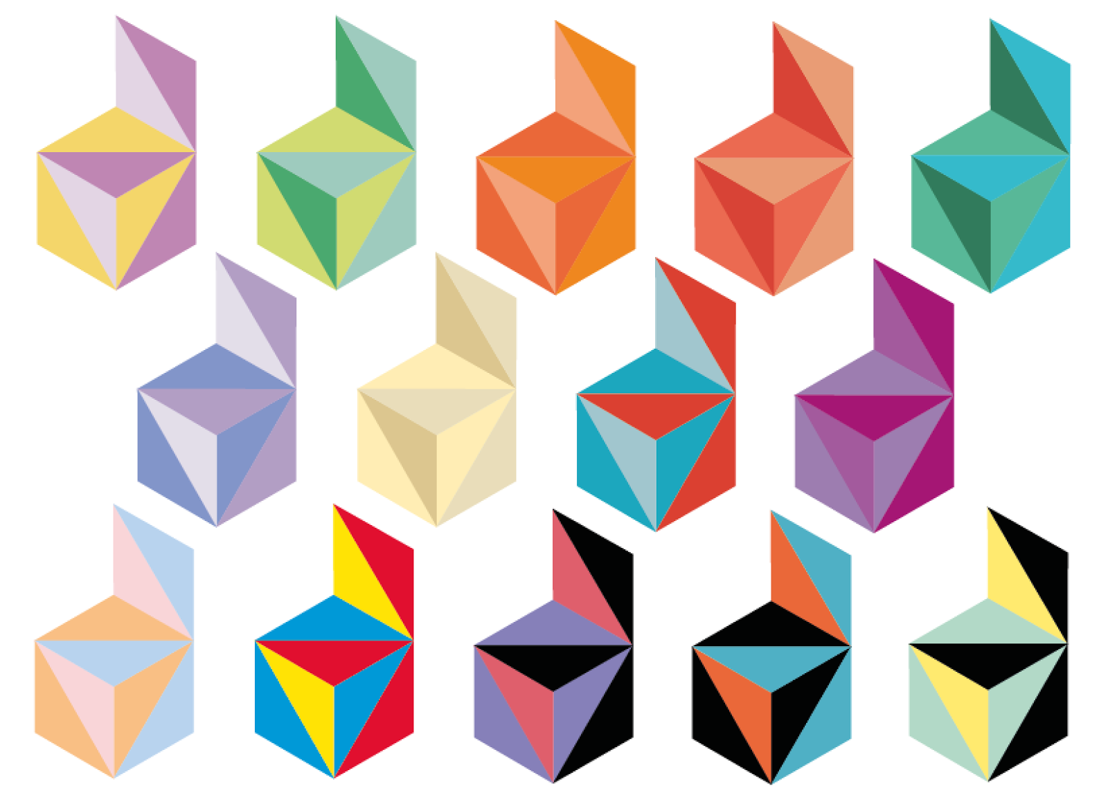
I definitely preferred the monochromatic combinations and the blue was my favourite as it looks calm and inviting which is something I want my brand identity to carry.


However, I liked the colour placement of this green logo so I used this design with the blue colours to get a more striking combination.

Choosing the Delta Media logo text:

Next I needed to decide on the typeface for the logo. I tried a range of typefaces from sans serif simple fonts to serif fonts that gave a more corporate look.

I also trief to experiment with using a different font for the A that looked more triangular like the triangles in the logo. However, I like this traditional serif font that is very clear and legible.

Finally, I put my favourite combinations together to make my final decision...
I definitely like this serif font as it is strong, corporate and legible


I then moved on to positioning...
I liked the placement of the name on two lines to sit next to the logo at a good size and allow the subheading to comfortably span across the company name.
After some feedback that the black font made it look more harsh than I had wanted (by using the blue colour scheme) so I used one of the blues in the logo and I think it gives it a more inviting look that suits my idea for the brand image better.

Final logo:


Business card development:

Initial design idea...
This is a little too bland and boring so I would like to go in a more unique direction.

I knew I wanted to turn the logo into a pattern early on so I started by duplicating the logo into a pattern

I then used the clipping mask to get the pattern covering my business card shape...
I added my original logo - this will act as the front of the business card.

After some feedback that the black logo didn't sit well against the pattern I changed the typeface to white. I think this is a lot softer and doesn't overwhelm the reader.

For the back of the business card I wanted to keep it simple and clear for the reader so I arranged the contact details in a serif font making their name larger and the headings in italics.


Brochure development:

Brochure cover...

I initially designed a cover that used the pattern heavily but I feel it makes the cover too busy and almost makes you go dizzy looking at the pattern in such a large scale.

Here is my final brochure cover which has a lot of white space to appear professional and sleek. I have used the triangle shapes from the logo (making some of them into rhombuses) and pasted in images to give an insight into the work of the company.


This was the original file with the two columns of Lorem Ipsum open for us to arrange and alter.

I inserted a headline in the same font as my logo to give a uniform look and to also give a strong title to this introduction page. I also added an border line to the bottom of the page using elements of the logo repeated - however this arrangement looks displaced so I will rethink this.

I then moved the title to join the text and leave a large amount of white space to let the page breath. I also changed the font to the same as my logo subheading - to again keep a uniform look.
I rearranged this bottom border to frame the page better whilst keeping that element of the branding close at all times.

Website developing:

We were given a basic web page document...

I added my pattern to the side panels and my logo to begin making it my won.

I added a pale blue navigation bar on two levels to give the buttons space to be seen and some social media icons to aid with keeping the audience updated. The image slideshow and welcome message use the same colour scheme and fonts to keep a uniform design.
The rhombus shape images help to continue the brand identity throughout the outcomes.

Mobile view:

For an additional outcome I designed the mobile view for the site - I condensed the navigation bar to one button that would allow the user to see the options only if they want to.

Letter head and compliment slip:

I initially put the border at the top and bottom of my letterhead design - however, this is a little too busy for a business letter...

I took the top border off and added a company address (I kept the same design for the compliment slip) I think this is a clean design to not distract from the letter message which the receiver will want to understand easily.

I also designed an envelope where my pattern is on the inside of the envelope to add a little interest the envelope.

Activity 1&2: Research

1) General Corporate Identity


2) City Identity


3) Mood Boards

Here is a mood board of the Honolulu landscape and culture...

Here is a mood board of different Honolulu maps...

Here is a mood board of existing typography that shows the style and tone that Hawaii/Honolulu usually has...

Here are some more snap shots of the city, the people and the architecture to get a feel for the entire city...

Here is a mood board of the potential colours to use in my branding (most have been taken from the images above) Having looked at a lot of existing city branding I have seen that the most successful ones use multiple colours to differentiate parts of the city.

Activity 3: Initial Ideas & Development (Logo)

To start thinking about potential logo styles I tested some different typefaces to see what style could work best. Although the script typeface suits the laid back style, I don't think it is bold enough to stand out as city branding.

I quickly tried a style that Amsterdam uses for their "I AMsterdam" campaign. However, I don't feel that it suits the vibe that you want to get from Honolulu.

Here are my sketches for the logo - I really like using the 'H' as an icon that could be really memorable like the McDonald's 'M' and I think the wave shape plays to Honolulu well


My favourite idea from my sketches was the 'wave' shaped H so I wanted to try it on Illustrator that also has the tag line inside the H. However, the tag line is far too small to make an impact.

I then continued onscreen development testing out some of my sketches as well as some new ideas. My favourite concept is still the wave shaped H.

I decided to try making the 'H' an icon and having Honolulu underneath to make the wave shaped H have maximum impact. I used a more dainty thickness to suit the relaxed vibe of Honolulu.

Now with my chosen logo concept I started experimenting with tag lines and the position they are in.
I don't think the 'love your...' fits well and as there is a famous phrase "Hawaiian Time" coined in Honolulu (meaning that people in Honolulu 'take their time' and are often late) so I decided to have my tag line as 'take your time'. I also decided to loose the idea of the tag line being inside the 'H' to not over complicate the icon.


I then experimented with different colours (from my colour scheme) and stokes...


Next I tried making the text of the logo an outline as my research into their architecture and culture suited this style.

I really liked a lot of the combinations but I wanted a colour scheme that reflected the laid back nature of the city and the teal and purple combination suited that best in my opinion.


 In my research I said I liked tinted photographs so I tried out a few options - here is how I got there.


Here are the various outcomes I got out of my experimentation.

After revisiting my research I remembered how using multiple colours gives the branding many more directions and broadens the possibilities for the outcomes. So I started looking at different combinations...

I used a two tone effect to give it more dimensions and make it stand out more from a distance. I feel like it really suits the vibrant and relaxed nature of the city and its people well while having a strong brand identity. The tag line is quite difficult to read from a distance but it is a handmade script font that has a personal feel that suits the city.

I then started to experiment with how the logo and the colour scheme could connect to the city and the other branding elements. I mentioned in my research that I liked the tinted photographs so I made up this postcard with the colours from the logo laid over an image of Hawaii...

I love making patterns so I broke up my logo to get these shapes and made up a pattern that fits with the style of the logo and could be used across many identity elements and outcomes.

Here is the finished pattern...


A possible application of the pattern could be the back of the business card...